
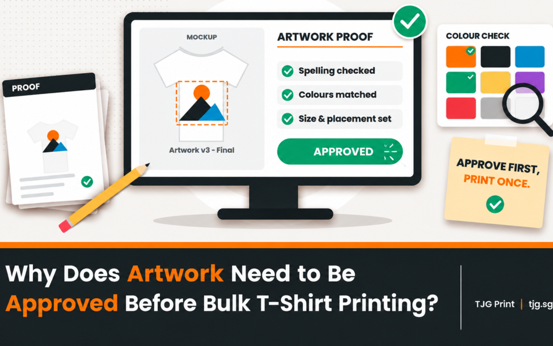
When people decide to print a t-shirt artwork, they expect everything to go smoothly. But at times mistakes happen and things can go awry, usually in small ways that only show up once the shirts are made.
Picture a familiar scene. You design your company logo on a laptop, it looks sharp on screen, and you send it off for 80 staff shirts. Two weeks later, the box arrives, and the logo looks soft around the edges, the blue is a shade darker than you pictured, and the tagline is in a font nobody chose. Nobody did anything carelessly. The file simply was not ready for print.
The good news is that most artwork problems are easy to spot once you know what to look for. Here is a practical guide from us at TJG, so your design arrives on the shirt the way you imagined it.
Why Artwork Matters More Than You Think
A screen and a shirt are very different surfaces. A screen glows and has millions of colors. A shirt absorbs ink, has texture and uses a limited set of colors, depending on the print method.
Artwork that looks perfect on a phone can behave very differently in production. That is why a quick artwork check before printing saves time, money and disappointment. It is also much cheaper to fix a file than to reprint a batch of shirts.
1. Low-Resolution Images
This is the most common problem of all.
Resolution describes how much detail an image contains. A small image stretched to fit a big print will look blurry or blocky, because there is not enough information to fill the space.
Here is where it often goes wrong:
- A logo saved from a website or social media profile
- A photo taken from a messaging app, which compresses the image
- A tiny file enlarged to fit a large chest or back print
As a general rule, print artwork should be about 300 DPI at the actual print size. If you can zoom in and see jagged edges or fuzzy lines, the file probably needs a better version.
What to do: Look for the original logo file or ask the designer for a larger version. Avoid screenshots whenever possible.
2. Using the Wrong File Format
Not all files are equal. Some formats are made for screens, and others are made for production.
- Raster files (JPG, PNG) are made of pixels. They can lose quality when enlarged.
- Vector files (AI, EPS, SVG, and often PDF) are made of lines and shapes. They can be resized without losing sharpness.
Vector artwork is generally the best choice for logos, text and clean graphics. Photos and detailed images are usually raster, and that is fine as long as the resolution is high enough.
What to do: If you have a vector version of your logo, send that first. Ask us which formats we can accept for your chosen print method.
3. Missing or Unconverted Fonts
Here is a problem that catches many people off guard.
When you use a font in a design file, the file does not always carry the font along with it. If the printer opens your file and does not have that font installed, the software swaps in a different one. Suddenly, your elegant heading looks plain, and the spacing is off.
What to do:
- Convert text to outlines (also called “create outlines” or “convert to curves”) before sending a vector file.
- Or send the font files along with your artwork.
- Or export a PDF with fonts embedded.
Outlining text turns letters into shapes, so they stay exactly as you designed them.
4. Linked Images That Are Missing
Design files sometimes link to images instead of embedding them. If the linked image is not sent with the file, the printer sees a blank space or a low-quality preview.
You may have seen a version of this, where a design opens with a “missing links” warning.
What to do: Embed images in the file, or package everything into one folder and send it together. A quick test is to open the file on another computer and see whether it looks the same.
5. Incorrect Colors
Colors are where screen and print differ the most.
Screens use RGB (red, green, blue), which can display very bright, glowing colors. Printed inks work differently, and some neon or highly saturated screen colors cannot be reproduced exactly on fabric.
Other color problems include:
- Shirt color affecting the print: A color printed on a dark shirt can look different from the same color on a white shirt.
- Brand colors not matched: “Blue” means many things. If color accuracy matters, give a specific color reference, such as a Pantone number, where applicable.
- Different methods, different results: Silkscreen, DTF and sublimation each reproduce color in their own way.
What to do: Share your exact brand color codes, and ask for a mockup. If color matching is critical, mention it early so the team can plan for it.
6. Too Many Colors for the Chosen Method
A design with a lot of colors can be a problem for some print methods.
Silkscreen printing needs a separate screen for each color, so a five-color design costs more than a one-color design. Gradients, shadows and photos are harder to achieve with traditional silkscreen. DTF and sublimation are usually better suited to detailed, full-color artwork.
What to do: Tell us about your design before choosing a method. Often, a small tweak, like simplifying a gradient into flat colors, keeps the look while reducing cost.
7. Thin Lines and Tiny Text
Fine details look crisp on a screen, but they can disappear on fabric.
Very thin lines, small text and delicate patterns may break up, fill in or fade, especially on textured or stretchy garments. This is even more noticeable with embroidery, where thread has a minimum thickness.
What to do: Keep text large enough to read from a normal distance, and avoid hairline strokes. If your design includes small text, tell us so we can check how it will print.
8. Wrong Size or Proportions
A design that fits perfectly on a letter-size page may look strange on a shirt.
Common size issues include:
- A logo that is too small to notice from across a room
- A print that is too large and sits awkwardly across the seams
- Artwork stretched or squashed to fit the space, which distorts the proportions
What to do: Always design to the actual print dimensions, and keep the aspect ratio locked when resizing. Check the placement on a mockup before approving.
9. Backgrounds That Should Not Be There
Many logos are saved with a white box behind them. On a white shirt, you will not notice. On a navy shirt, that white box prints as a visible rectangle.
What to do: Use a version of your logo with a transparent background, or ask us to remove the background before printing.
10. Copyright and Usage Issues
Not every image found online is free to use. Printing a copyrighted character, a brand logo you do not own or a downloaded graphic can cause legal problems later.
What to do: Use artwork you created, own or have the right to use. If you are unsure, check the license first.
11. Typos and Last-Minute Changes
This one sounds obvious, but it happens all the time. A misspelled name, a wrong date or an outdated logo gets approved in a hurry, and the mistake is printed on every shirt.
What to do: Have at least two people proofread the mockup, and double-check names, dates and spellings before approval.
How to Check Your Artwork Before Sending It
Run through this quick checklist:
- Is the image sharp when zoomed in?
- Is the file a vector, or a high-resolution image?
- Have fonts been outlined or included?
- Are all images embedded or attached?
- Are colors specified, with codes where possible?
- Is the design suitable for the print method?
- Are lines and text thick enough to print clearly?
- Is the background transparent where it should be?
- Does the size match the intended print area?
- Has someone else proofread it?
If you can answer yes to these, you are well prepared. If you want to see how the artwork choices affect pricing, our guide on why two T-shirt printing quotes can have different prices is a helpful read.
Not a Designer? That Is Fine
You do not need design skills to get good results. Many of our customers send us a rough logo, a sketch or a screenshot and ask for help.
Send us what you have, and our team will review it, point out any issues and suggest fixes. We can also share a mockup so you can see how the design will look on the shirt before production starts. You can reach us through our website, by email at sales@tjg.sg, or by WhatsApp at +65 8774 0792.
Conclusion
Most printing disappointments start with the file, not the printer. Resolution, fonts, colors, file formats and sizing all play a part, and each one is easy to fix before production. A few minutes of checking can spare you from a batch of shirts that look nothing like your screen. And if you are ever unsure about what can go wrong with T-shirt artwork before printing, send it to TJG and we will take a look with you.
Frequently Asked Questions
What are the most common artwork problems before t-shirt printing?
The most common issues are low-resolution images, missing fonts, incorrect colors, the wrong file format, unwanted backgrounds and designs that are too detailed for the chosen print method. Typos and wrong sizing also show up often.
Why does low-resolution artwork cause poor-quality t-shirt prints?
A low-resolution image contains too little detail for a large print area. When it is enlarged, the edges turn blurry or pixelated. A file of about 300 DPI at the actual print size, or a vector file, gives much sharper results.
How can incorrect colors affect the final printed t-shirt?
Screens display colors using light, while prints use ink on fabric, so some shades look different once printed. Shirt color, print method and color mode all affect the result. Sharing exact color codes and approving a mockup helps avoid surprises.
What happens if fonts or images are missing from the artwork file?
If a font is missing, the software replaces it with a default, which changes the look and spacing of your text. If linked images are missing, they may appear blank or low quality. Outlining text and embedding images prevents both problems.
How can I check my artwork before sending it for printing?
Zoom in to check sharpness, confirm the file format, outline your fonts, embed all images and check colors and sizing. Ask someone else to proofread it. You can also send it to TJG for a review and request a mockup before production.